t-distributed Stochastic Neighbor Embedding
A family of machine learning techniques that use multi-layered neural networks to automatically learn complex patterns and representations from raw data.
A Culinary Example
t-SNE (t-distributed Stochastic Neighbor Embedding) is a tool that helps you visualize complex data.
When you have data with many features — like 10, 50, or even 100+ columns — it becomes impossible to see relationships between data points just by looking at a table. t-SNE helps by turning that complex, high-dimensional data into a simple 2D plot, where similar points end up close together and very different points are far apart.
To do this, t-SNE first measures how similar each point is to every other point based on their features. It calculates the distance between each pair of points — points that are close together are considered more similar. Then, it converts those distances into probabilities that reflect how likely each pair of points would be “neighbors.”
Finally, t-SNE tries to recreate those same neighbor relationships in a 2D space. The result is a map where you can visually explore the structure of your data, spot patterns, and often see natural groupings or clusters — even if the original data had dozens or hundreds of variables.
Overview
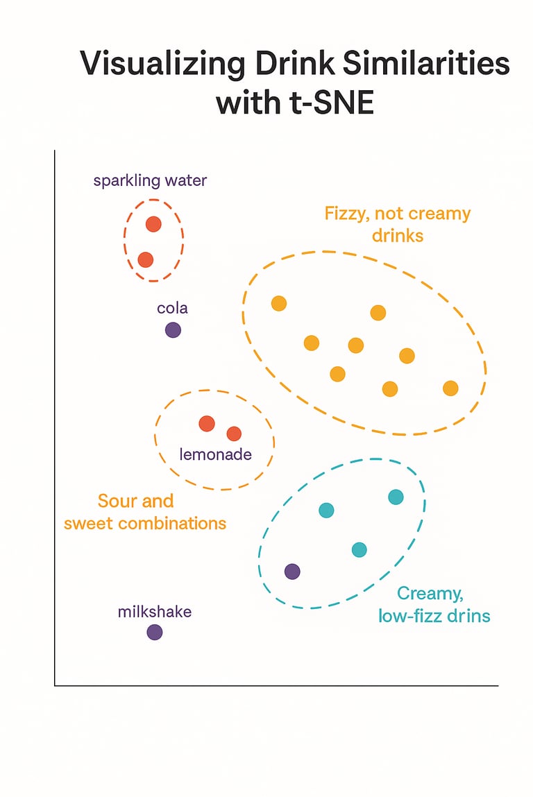
Suppose a researcher is studying how different beverages are perceived in terms of taste. They’ve asked participants to rate a variety of drinks — like soda, lemonade, energy drinks, milk-based beverages, and sparkling water — based on four characteristics:
Sweetness
Sourness
Fizziness
Creaminess
Each drink ends up with a score for each trait, turning every beverage into a point in 4-dimensional space.
The Problem:
With each drink described by four numbers, it’s hard to get a sense of how they all relate to one another.
Are there groups of drinks that are experienced similarly?
Which ones are completely unique?
Simply looking at the raw data doesn’t make patterns obvious.
This is where t-SNE comes in. t-SNE takes the 4D taste ratings and projects them into a 2D map, while trying to keep similar drinks close together and dissimilar ones farther apart — based on how people rated them.
t-SNE Output:
Drinks with similar flavor profiles are close together (like cola and sparkling water — both fizzy). On the 2D plot generated by t-SNE, you might notice:
A tight cluster of carbonated drinks that are high in fizziness but low in creaminess.
Another group of rich, smooth drinks that are creamy and not very fizzy.
Some hybrids or outliers that don’t neatly fit either group — maybe a lightly fizzy, slightly creamy drink that stands alone.
You haven’t assigned these groups — t-SNE just arranged the data so these patterns are visually clear.
Why This Is Helpful:
You get a visual overview of how items relate based on multiple features.
It can guide decisions (e.g., comparisons, marketing, further analysis).
And it’s especially useful when you’re working with many features and want a way to make sense of them.
Connect with Me!
LinkedIn: caroline-rennier
Email: caroline@rennier.com